01
Aura
A lighting systems brand built on electric presence and precision geometry. The radial mark channels light in motion — dynamic, directional, unmistakable. Electric yellow on near-black creates a contrast that commands attention without noise.
- CATEGORY
- LIGHTING SYSTEMS
- ROLE
- BRAND IDENTITY / LOGO DESIGN / ART DIRECTION
- YEAR
- 2026
Brand identity
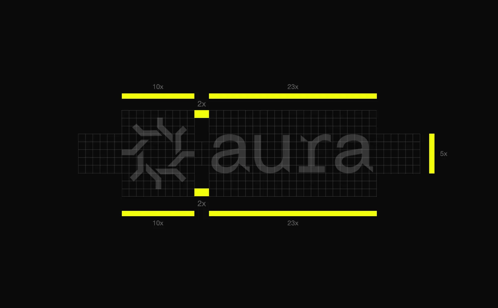
The radial symbol is built on a strict grid — 10x clear space on the short axis, 23x on the long, 2x internal gap. Every application respects these rules, making the mark instantly recognisable at any scale.
In application
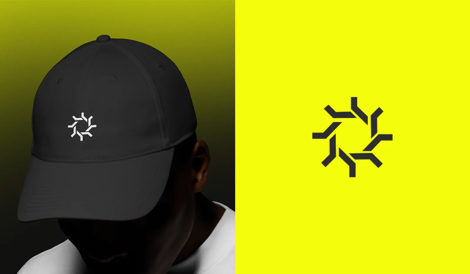
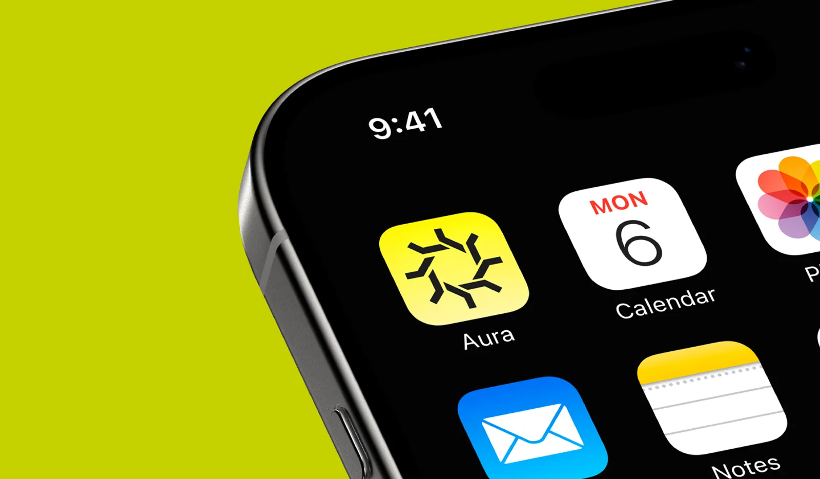
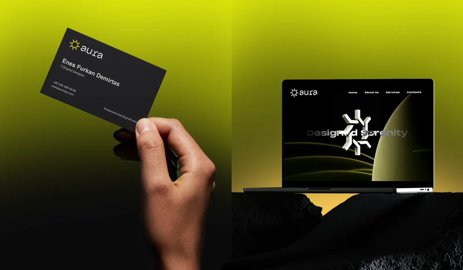
Light captured in geometry — a mark that energises every surface it lands on. From a cap to an app icon, a business card to an interface, the system speaks the same language throughout.
NEXT PROJECTPalu